ShopDreamUp AI ArtDreamUp
Deviation Actions


Suggested Deviants


Suggested Collections


You Might Like…


Description
EDIT: Yay, photographic betterness + a few improvements...any more suggestions people?
-----
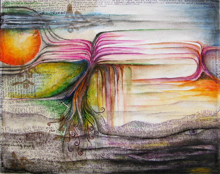
When the sun touches the earthe
many beginnings past
a garden will grow of light
and the earthe will shift
all knowledge flowing from it like a torrent
until only sun, ocean and the wisest trees remain
the ones that have seen all knowledge
and let it pass by on the breeze
The first of about twenty works that I will create over the next eleven or so weeks for an exhibition in Visby. My theme is, as yet, undetermined, but I will create works mainly in this style of symbolic landscape over- and under-layed with text. I will post each one as it is created and each time I will ask for critique. This exhibition, being my first, is not something that I want to screw up too badly so if you see something that makes you go "eew", tell me about it (preferably in a constructive manner - "that looks like crap" may be perfectly true, but it is not helpful so I would ask that you refrain from saying so).
Info about this piece:
Title: "Garden of Light"
Dimensions: 35 x 27 cm
Media: water colour pencils, wrapping paper, tissue paper, charcoal, black ballpoint pen and gloss varnish
Blurb: poem (above) written in english and swedish
Help I need with this piece:
composition - especially the balance between light and dark
possibly a better title
It's worth mentioning that this photo does approximately 0 justice to the original piece because I'm terrible at working with dodgy lighting. If you try to tell me that the colours are not nice, I will ignore you because I can assure you that the colours are quite beautiful in the original. Plus the glare in the middle is a bummer but it's the best I could do.
Thanks in advance for your advice and sorry for making you read all that.
-----
When the sun touches the earthe
many beginnings past
a garden will grow of light
and the earthe will shift
all knowledge flowing from it like a torrent
until only sun, ocean and the wisest trees remain
the ones that have seen all knowledge
and let it pass by on the breeze
The first of about twenty works that I will create over the next eleven or so weeks for an exhibition in Visby. My theme is, as yet, undetermined, but I will create works mainly in this style of symbolic landscape over- and under-layed with text. I will post each one as it is created and each time I will ask for critique. This exhibition, being my first, is not something that I want to screw up too badly so if you see something that makes you go "eew", tell me about it (preferably in a constructive manner - "that looks like crap" may be perfectly true, but it is not helpful so I would ask that you refrain from saying so).
Info about this piece:
Title: "Garden of Light"
Dimensions: 35 x 27 cm
Media: water colour pencils, wrapping paper, tissue paper, charcoal, black ballpoint pen and gloss varnish
Blurb: poem (above) written in english and swedish
Help I need with this piece:
composition - especially the balance between light and dark
possibly a better title
It's worth mentioning that this photo does approximately 0 justice to the original piece because I'm terrible at working with dodgy lighting. If you try to tell me that the colours are not nice, I will ignore you because I can assure you that the colours are quite beautiful in the original. Plus the glare in the middle is a bummer but it's the best I could do.
Thanks in advance for your advice and sorry for making you read all that.
Image size
714x567px 274.22 KB
Make
Canon
Model
Canon PowerShot A400
Shutter Speed
1/636 second
Aperture
F/5.6
Focal Length
6 mm
Date Taken
Apr 15, 2006, 3:03:24 PM
© 2006 - 2024 Impi-child
Comments9
Join the community to add your comment. Already a deviant? Log In
very nice ")